Notes from Natasha
 Looking to take your career to the next level? Designer Society of America has the solution for you. Consider sitting for our Residential Interior Designer Exam (R.I.D.E) created for interior design professionals just like you.
The R.I.D.E. qualifying examination is available to residential interior designers who want to advance their education, career and professional status in the industry. If you are driven to succeed and dedicated to your profession, successful completion of the R.I.D.E. will enhance your status among residential interior design peers who have also reached this higher level of certification achievement.
Recognized as an industry standard for excellence and certification, the R.I.D.E. testing program can be the professional boost you need to grow your business and your reputation.A two-part examination, the R.I.D.E. fully conforms to established testing standards and is administered by testing centers across the country. For your convenience, the exam is available both on scheduled dates and on an as-needed basis.
For more information about the R.I.D.E., visit us online at www.residentialinteriordesigncertification.org.
 Just a reminder - We are headed to Atlanta for the 2010 International Window Visions Convention EXPO May 13-15 - and you can be, too! All DSA members will receive free VIP passes to attend the event being held at the Georgia World Congress Center in Atlanta. The show is being held in conjunction with the 2010 Southern Building Show.
All the best!
Founder
Designer Society of America
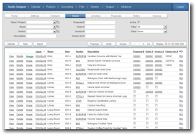 "Studio Designer can help interior designers manage their entire business by providing them with a process that frees them up to do what they do best - design," said Haeberle.
 There is no start up fee, no installation and subscribers can cancel at any time. Studio Designer is both MAC and PC compatible, and at just $25 a month for Designer Basic and $35 a month for Designer Professional, is very affordable. In addition, Studio Designer has the ability to interface with many other technologies, added Haeberle.
 Did you pick out your client's wall color in your office where it looked fantastic? Does your client (or you) have UV film on the windows; tinted glass, reflections from outside landscaping, lots of natural light, or very little light? What type of light bulbs will be used? Will more time be spent in the room in the evening or daytime? Will the color look stronger in the afternoon light than in the morning? Since color is constantly changing due to the angle of the sun, quite possibly there will be a certain time of day it looks very different in light and shadow. Wall color, especially, needs to be selected in the environment where it will be used, not chosen in a different location.
 If I asked you why you became an interior designer, you might tell me that you used to rearrange your room as a child, or your friends always commented about your fabulous style and asked you to help them with their homes. At some point, you just knew you wanted to be an interior designer. And then you went to school. You learned how to do design, and maybe you had a class or two about business. But did any of your teachers really talk about how to get clients, and once you got them, how to make them happy?
 Gail Doby, ASID, DSA, has over 30 years of business experience with a Fortune 500 company in sales and marketing, her own consulting practice working with a subsidiary of American Airlines on a quick-turn facilities build-out project and 23 years running her own high-end interior design firm, specializing in renovation and new construction design for ultra affluent clients.
 In 1994, he formed his own interior design business, operating between Grosse Pointe Farms and Chicago. By 1995, he was in Chicago full time, and today his client base ranges from Chicago to the North Shore to Hinsdale, Illinois. He has also worked inManhattan, Palm Beach and the Rhode Island shore.